This is a research file of sorts, related to this blog. As the blog is to be handed in electronically, I have just typed up the links etc that I have been using while creating this blog, and some of the quotes that I found interesting, and saved it as a PDF, which you can hopefully see below.
Laura Stokes Contextualising Design Blog - Research File

Blog for my thoughts and opinions on the Contextualising Design module lectures I will be receiving over the next 10 weeks
Friday, 30 December 2011
Wednesday, 14 December 2011
Manufactured Landscapes - Lecture 15 - 8-12-11
So, for this lecture, we started to watch the documentary film, 'Manufactured Landscapes'.


'Manufactured Landscapes' is a documentary film based on the work of photographer Edward Burtynsky. Edward Burtynsky is a Canadian photographer who is well-known for his large scale photographs of industrial landscapes.
In 'Manufactured Landscapes', the director, Jennifer Baichwal, follows Burtynsky around places like China and Bangladesh, visiting areas that have been transformed due to human activity; places like slums, e-waste dumps and huge industrial factories. Burtynsky concentrated a lot on the extraction industry in his work, and because of this, he brought the seriousness/conditions of this industry to our consciousness/attention.
When working in China, Burtynsky looked at where all the products of manufacturing come together, i.e. the factories. One of the factories that Burtynsky and the film focused on was Sentai Electrical. They explain what they do on their website: "We are one leading manufacturer and exporter of low voltage electrical products and materials in China."

Burtynsky explained his 1997 work on oil as an "oil-phipany", and went on to explain what this was; he was driving along and thought how oil affects his life, for example, the steering wheel he was holding, the car he was driving etc. This is how he went on to complete a volume of work on oil works etc.
Burtynsky even asks that because China entered the market of extracting oil later than others, and will they be able to sustain?
I must admit, I am struggling to see how this relates to my work, but I do appreciate Burtynsky's work. I admire how he uses just a boring industry landscape, but then through his camera lens, he turns it into something relatable and fascinating. I would never think of taking something so mundane as a factory, or an mine, or a recycling yard, and making a volume of work on this, and eventually making a whole career on it. This could be something that I think about in my future work; to look at everything, and not dismiss it because it looks 'too boring'.
Postmodernism - Lecture 14 - 6-12-11
Postmodernism is often considered as the beginning of where we are today in the design world. Postmodernism believes that apparent realities are only social constructs and are therefore subject to change. It also underlines the role of language, power relations and motivations. The challenges Postmodernism faced were severe categorising, such as male v. female, straight v. gay and white v. black.
There are distinctive visual characteristics in Post-Modern style that blends history, new technology and decoration together. Postmodernists went on to question Modernism's purity and pristine demands, starting with throwing out the notion that form depends on function. A good example of this is a Duck building vs. a Decorated Shed. A Duck building, is a building formed in to portray what the activity held within the building. It is named after the "The Big Duck," in Long Island, New York, which originally sold ducks and duck eggs. Whereas a Decorated Shed is a very simple shed-like building (i.e. a basic rectangle building), which have large-scale text and symbols added to it, to inform the quickly moving passer-by what is in these buildings.


There are distinctive visual characteristics in Post-Modern style that blends history, new technology and decoration together. Postmodernists went on to question Modernism's purity and pristine demands, starting with throwing out the notion that form depends on function. A good example of this is a Duck building vs. a Decorated Shed. A Duck building, is a building formed in to portray what the activity held within the building. It is named after the "The Big Duck," in Long Island, New York, which originally sold ducks and duck eggs. Whereas a Decorated Shed is a very simple shed-like building (i.e. a basic rectangle building), which have large-scale text and symbols added to it, to inform the quickly moving passer-by what is in these buildings.


Above: The Big Duck, Flanders, Long Island, New York
Left: Duck v. Decorated Shed
Some good examples of Postmodernist artists, are: Tadanori Yokoo, Ettore Sottsass, Wolfgang Weingart, April Greiman, Ed Fella and Katherine McCoy.


Above: (Left) Tadanori Yokoo (Right) Ettore Sottsass


Above: Ed Fella
Overall, I do believe that Postmodernism is the beginning of where we are today, design-wise. I believe that Postmodernism is also a major part of how we have gotten to be where we are today, and without it, I don't think that design would so significant in our society and wouldn't play such a huge role in our day-to-day lives. Like with every movement in the art and design world, there are some artists/designers in the Postmodernist movement that I really don't like, but there are some that that I do really like, particularly Ed Fella, and his hand-drawn type. I particularly like the quote in the above picture, because I feel that at the moment, I do concentrate a lot on what I think people want, and not what I want, so this is hopefully something that I take into future work; that being, you don't always have to follow the 'rules' so tightly, you can break some, but only if it works.
Friday, 9 December 2011
Quote 11 - Tim Brown
"There are useful starting points and landmarks, but the road to innovation consists of overlapping spaces or paths, rather than a sequence of steps in one direction." Tim Brown


Tim Brown is the CEO of the innovation and design firm, IDEO
Again, this quote took some digesting, but I completely agree with this quote. People tend to think (well, people I've spoken to) that designing something is quite a straight forward process, but this not the reality at all. I had this trouble with our last brief for the module ARD 502 The Message; thinking that it would be quite a straightforward process, and then underestimating it, and having to back track on the process, to get the final piece stage. I believe that this quote is one of the most important quotes out of the selection that was given to us, and I will keep this in mind for all my future projects.
(P.S. This is the last of the quotes, so back to normal lecture notes/thoughts from now on)
(P.S. This is the last of the quotes, so back to normal lecture notes/thoughts from now on)
Quote 10 - Maurice Merleau-Ponty
"The body is much more than a tool or a means...it is our expression in the world." Maurice Merleau-Ponty


Maurice Merleau-Ponty was a phenomenological philosopher.
When I first read this quote, I thought that this was more relevant to Fine Art students. I still believe this, but I can understand it's relevance to anyone in the art and design world. I'm not entirely sure if I agree or disagree with this quote. I believe that, in the art world, the body is more than a tool or a means, you can express various emotions/expressions through the body, and you can instantly tell the way someone feels through their body language. You can also tell a lot about a person by the way they hold themselves. However, the body is an extremely important tool, and as a way of achieving certain means.
Quote 9 - Christopher Grunenberg
"The return by many contemporary artists to the use of clay signals not only a rejection of those values associated with Modernism, but also a visceral concern for the materiality of experience at a time when many cultural commentators are talking about the death of the concrete object in favour of the new virtual world of the information era." Christopher Grunenberg
When I first read this quote, I was quite confused by it, and didn't really get the meaning of it, and what the relation was between the quote and myself. To be honest, even after a second and third read through, I still thought this. Now, however, I can see a relationship between the quote and myself, and the meaning behind it.
I do, to some extent, agree with this quote, that the use of materials such as clay, does signal a rise in the appreciation and use of "concrete objects" instead of the ever-changing, ever-improving world of information technology. I think that this is inevitable, though, because, like with everything, the digital v. traditional side has a cycle, and they take it in turns to come back into 'fashion' and go out of 'fashion'. I don't agree with the first part of the quote, where it says "...the use of clay signals...a rejection of those values associated with Modernism...". I don't believe that it is rejecting the values of Modernism, but that it is a adding a new 'branch' to the Modernist 'tree.'
Monday, 5 December 2011
Quote 8 - Darrell Bishop
"I think skills are currently really underappreciated in design. Skills are too often thought of as a way of implementing design, whereas I have found the learning of skills to be one of the most important ways of actually changing my way of thinking about things." Darrell Bishop
I agree with part of this quote. I don't necessarily think that skills are underappreciated in design, as we, at university, are being taught to learn as many skills as we can at the moment, and that way, we have them for future work, and can say that we have tried something, and say if we don't like using something. I agree with the second part of the quote, because the more skills you learn, the more you know, and so you can ask yourself more questions, which will change the way you think about things. Personally, I have learnt only a few skills, compared to what I will someday, at uni, and already I am starting to change the way I think about things when given a new brief etc.
I agree with part of this quote. I don't necessarily think that skills are underappreciated in design, as we, at university, are being taught to learn as many skills as we can at the moment, and that way, we have them for future work, and can say that we have tried something, and say if we don't like using something. I agree with the second part of the quote, because the more skills you learn, the more you know, and so you can ask yourself more questions, which will change the way you think about things. Personally, I have learnt only a few skills, compared to what I will someday, at uni, and already I am starting to change the way I think about things when given a new brief etc.
Green Thinking - Lecture 13 - 1-12-11
This lecture linked into/carried off from the Designers and Ethics lecture, from a couple of weeks ago.
I think this is a very personal subject. Some people have very strong beliefs about ethics, and being green, but other people may not have such strong beliefs. I personally stand on the fence, but I would like to think that if something came up, which I didn't agree with, I would stand up for what I believe, and walk away from it.
Greenwash is where more is spent by the company (or government) on advertising their greenness rather than on investing on environmentally sound practices. I think that this is wrong, and rather than shouting about what they do that is environmentally friendly, they should just get on with it, and start using environmentally friendly processes, and then these will speak volumes for them.
80% of the environmental impact is determined at the design stage. When you put it this way, you can tell that something really needs to be done, especially in the design sector. Shouldn't we choose/consider the things that we use more carefully?
Last year, a new product was launched nearly every 3 minutes, with most of these products involving the inefficient use of energy, water and natural resources. All these ideas, images, symbols and forms has as their outcome unsustainable consumption. This links in to the last lecture, that when you look around the shops, especially at this time of the year, you see so many things to buy, and a lot of it is a load of rubbish, and you think 'who would buy this?'. A lot of it is just a waste of time, and energy, which we will never get back.
The biggest company with carbon dioxide emissions is EXXON, which produces 146m tonnes of carbon dioxide per year, which equals the annual emissions of the United Arab Emirates.
An interesting view point on this is Michael Johnson's, which was if you type in Google, 'sustainable graphic design', you only get 1,000 hits, but if you type in 'helvetica movie', you get 15,000 hits. I believe this provides a good overall view of where we are at the moment, in respect to the design stage/sector and sustainability.
Wednesday, 30 November 2011
Quote 7 - Stanley Kubrick
"The screen is a magic medium. It has such power that it can retain interest as it conveys emotions and moods that no other art form can hope to tackle." Stanley Kubrick


Stanley Kubrick was a film director, writer, producer and photographer. His most notable works include: Dr. Strangelove, 2001: A Space Odyssey, The Shining, Full Metal Jacket, and A Clockwork Orange
I completely, and utterly agree with this quote, 100%. In film-making you can convey emotion and mood much, much more easily than an illustrated piece of work. You do have to think about the music that will play in the background, and the lighting and colour captured in the film, to make sure you are getting across the mood and emotion you want to be captured and portrayed, but it is a lot easier and powerful than any other form. It is so hard to capture a mood and/or emotion with illustration, and illustrator's who achieve this, I truly admire. I've never been one of those people who would go to watch and film, and then spend the whole film and afterwards, critically evaluating it, e.g. good shots? right music? right/good actors?, but since I have started Art College, I am beginning to be more aware of great film making, and appreciating as an art form of its own.
Quote 6 - Norman McLaren
"Animation is not the art of drawings that move but the art of movements that are drawn. What happens between each frame is much more important than what exists on each frame." Norman McLaren


Norman McLaren was a animator and film director, best known for his work with the National Film Board of Canada (NFB)
Now, we dabbled in animation last year, granted it wasn't anything like major, just the basics, but it really didn't agree with me. I can completely appreciate other people's work in animation, but I could never do it for a living, or just for myself. I'll try not to be biased when it comes to animation quotes because of this. Anyway, moving onto the quote, I completely agree with the first part of this quote. As an illustrator, it is so much harder to create movement in a still image, and this is a part of animation which I admire. I disagree with the second sentence of this quote, "What happens between each frame is much more important than what exists on each frame," because I believe that you have to show what is happening on each frame/illustration. I suppose, to some extent, you can let your audience decide for themselves what happens between each frame, but this doesn't work as well in children's book illustration and illustration in general. I believe that if you haven't fully explained the story in all of your frames/illustration, then it wont be very successful. I might be looking at this from a children's illustrator's point of view too much, but these are my personal beliefs.
Quote 5 - Brendan Dawes
"Sometimes designers lose sight of a fundamental question: 'Does anybody actually want this?' And when I say anybody, I don't mean geeks, I mean people like my mum, or even your mum." Brendan Dawes

I believe that this is very important quote, and the question, 'Does anybody actually want this?' should be regularly asked each and every designer. When you take a look around stores etc, especially at this time of the year, with Christmas around the corner, and you see some of the stuff they are selling, you really do wonder, 'Who would buy that? Honestly?' As much as I like the thought/idea of designing for yourself and for your own benefit, I believe that if you have been commissioned by a client, who are paying you to come up with a original and GOOD idea, then that is what you should do. I hope that I will always remember to ask this question in my work practice in the present and future.

Brendan Dawes is a artist, designer and author and the founder of Beep Industries
Quote 4 - Ansel Adams
"Not everybody trusts paintings but people believe photographs." Ansel Adams


Ansel Adams was a photographer and environmentalist, best known for his black and white photographs of the American West.
From an illustrator's point of view, I first agreed with this quote. One of the first thoughts that made me agree with this quote, was a example of this quote in use, that you can easily paint a unicorn, rather than having to find one and take a picture of one; people are more likely to trust the photograph, because they believe that to take that photograph, the photographer would have had to find a real-life unicorn. However, upon thinking about it, the thought that I had was considering the technology around today, I think this quote is not quite right, mainly due to the fact that, yes, a photograph is more likely to gain people's trust, because you have to have a subject to take a photo of, but nowadays, with software like Photoshop, and Green Screens, you don't necessarily have to have a real-life subject; you can easily take a photograph of where you want the scene to be based, and then upload it onto the computer, and layer something over the top; digitally manipulating the photograph.
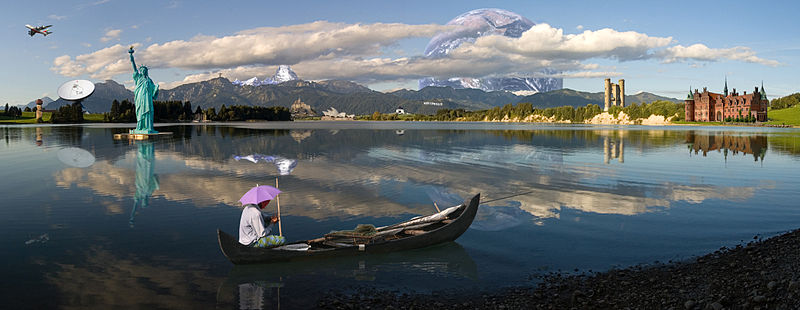
An example of photo manipulation; a photomontage of 16 photographs, which have been manipulated to create the illusion that it is a real landscape.
Monday, 28 November 2011
Quote 3 - Marshall McLuhan
"In our new global village the consumers will become the producers." Marshall McLuhan


Marshall McLuhan was a educator, philosopher and scholar. He is most known for the expression "the medium is the message", and eventually writing the book "The Medium is the Massage".
This quote was first introduced during the Innovation lecture, and my first, honest, thought was 'that doesn't make much sense'. However, once the lecturer, gave an example to explain this, it made slightly more sense. The example given was Social Networking Sites, in particular Facebook. The fact that us (the consumers) are using the site and interacting with it, eventually leads to us producing the site. I suppose to some extreme this is true, that because we are living in the technological age, where we are regularly checking our Twitter and Facebook accounts, and our e-mail's, even when we are away from home, means that because the consumers interact with the sites etc, leads to the consumers becoming the producer.
Quote 2 - Charles Eames
"Artists are trouble makers. Designers are problem solvers." Charles Eames


Charles Eames was a designer, and made major contributions to modern architecture and furniture. He worked a lot with his wife, Ray Eames, and this is how they are most well-known. They also worked in industrial and graphic design, film and and fine art.


These are two pieces of furniture that Ray and Charles Eames were well-known for. Left: Eames Lounge Chair Wood (LCW) Right: Eames Lounge Chair and ottoman
When I first read this quote, I thought, 'that's a little unfair, labelling people as certain things', but when I read it again, I don't believe that the quote is being unfair, it's just trying to differentiate between artists and designers. I do believe that designers are problem solvers, because of the fact that we are given briefs from clients, and in these briefs, there are several problems, and we have to find a way to overcome them. I wouldn't necessarily say that artists are 'troublemakers'. I believe that they can too be problem solvers, the only difference I think is, fine artists do their work for themselves and if they come across problems, then they overcome these however they want; they do not have a set guidelines which they are to follow, in order to reach the client's final goal. In my opinion, a artist and a designer does not have much difference. I believe that they are the same, and it wasn't until I started Art College, that I started to think of myself as a designer, rather than a artist.
Quote 1 - Victor Papanek
"The only important thing about design is how it relates to people." Victor Papanek


Victor Papanek was a reowned designer and professor. He created a more ecological and ethical centred design process. He is well known for his book "Design for the Real World: Human Ecology and Social Change," which is one of the most read design books today.
When I first read this quote, my immediate thought was 'no, that's not right', as I thought design has several important factors, and you couldn't single out a certain factor as more important than another. However, upon reading the quote again, I actually agree with it; if a design doesn't relate to people, then the design is not going to be very successful at all, people won't relate to it, so they won't understand it, and won't want to support it. There is still that thought at the back of my head, that says 'there is more important factors about design', but the more I think and read this quote, the more this thought is disappearing. I would like to think that another important thing about design is just doing it for yourself and your own benefit, but after working as a professional for a number of years, this view may start to fade.
Quotes galore!
Only had one lecture last week, (Tuesday, 22-11-11), and that was just talking about ways to improve our blogs and how we should be blogging. One of the points that came up was that we should be blogging about the quotes that are on the back of our module packs. I haven't been doing this so far, so over the next few weeks, I will be blogging my thoughts, opinions and responses to these quotes. The deadline is getting nearer!
Friday, 25 November 2011
Visual Music - Lecture 12 - 17-11-11
There is a long history of linking sound to colour together. Aristotle and Pythagoras were among those who first made the link.


Goethe carries out a lot of work studying afterimage of complimentary colour and how the placing of colours on different coloured grounds changes our perception of the colour.
Acrimbaoldo unusually equated darkness with high-pitched sounds. He was interested in the concept of a three-dimensional colour space but was unable to make much progress with this.
In 1669, Newton argued for a 'musical' division of the spectrum of white light. His first scale of 11 colours was reduced to 5 'more prominent colours', to which he added orange and indigo to make the parts more elegantly proportioned to one another.

Newton's musical colours disc
Newton, in his book, Optiks, suggested that the perceived harmonies of sound and colour might be related to their both being vibratory phenomena. This gave a new lease of life to the ancient belief in universal harmony. The prototype machine, used coloured strips of paper, which rose above the cover of the harpsichord, and seemed to be in use by 1730. Newton also tried candles and lanterns with coloured glass but the idea was ahead of the technology available at the time.

Castell's ocular harpsichord
Overall, I believe that there is a link between colour and emotion, and that you can express emotion through a certain colour, for example, red could mean danger; yellow, could mean happy etc. I think this is an important part of illustration (especially children's illustration); finding the right colour to express what you are trying to get across to your audience, and I think I need to focus a lot more on this in my work. However, I am not so certain that there is a strong a link between music and colour, I suppose that there is some sort of link between happy music and a happy colour, and then a sad music, and sad colour. It is just my personal opinion, that the link between music and colour is not as strong as the link between emotion and colour in artwork.
Cold War Modernism - Lecture 11 - 15-11-11
Art and design played an important role in representing and sometimes challenging the dominant political and social ideas of the age.
Life after 1945 seemed to promise both utopia and catastrophe, due to the invention of nuclear weapons. A state of political conflict, military tension, proxy wars, and economic competition between the Communist World and the Western World, arrived in 1945 and carried on until 1991.
Artists such as Walter Womacka responded to this dual vision, searching for ways to build a new and hopeful future and deal with the anxieties of the present.

This idea of a utopian society brought about the argument of of utopia v. dystopia. Is our society today a utopian or dystopian society?
Utopia - An imagined place or state of things in which everything is perfect.
Dystopia - An imagined place or state in which everything is unpleasant or bad.
I believe that society today, has factors of both, and it would be extremely difficult to definitively label our society one or the other. We are a utopian society, because we have the freedom of free speech, we live in a respected country, and we have some great architecture and monuments. However, when you look at the definition of dystopia, you could list many things about our society that are 'unpleasant or bad', these include: the war that is still continuing, even after 10 years; the amount of poverty in the UK; the amount of homelessness; the rate of unemployment; the recession that is happening. There are more, but these just give a good view, of why our society could be labelled as dystopia.
Life after 1945 seemed to promise both utopia and catastrophe, due to the invention of nuclear weapons. A state of political conflict, military tension, proxy wars, and economic competition between the Communist World and the Western World, arrived in 1945 and carried on until 1991.
Artists such as Walter Womacka responded to this dual vision, searching for ways to build a new and hopeful future and deal with the anxieties of the present.

An example of Walter Womacka's work
This idea of a utopian society brought about the argument of of utopia v. dystopia. Is our society today a utopian or dystopian society?
Utopia - An imagined place or state of things in which everything is perfect.
Dystopia - An imagined place or state in which everything is unpleasant or bad.
I believe that society today, has factors of both, and it would be extremely difficult to definitively label our society one or the other. We are a utopian society, because we have the freedom of free speech, we live in a respected country, and we have some great architecture and monuments. However, when you look at the definition of dystopia, you could list many things about our society that are 'unpleasant or bad', these include: the war that is still continuing, even after 10 years; the amount of poverty in the UK; the amount of homelessness; the rate of unemployment; the recession that is happening. There are more, but these just give a good view, of why our society could be labelled as dystopia.
Sunday, 13 November 2011
Designers and Ethics - Lecture 10 - 10-11-11
The design community is part of a socio-economic system, which assumes limitless growth and a continual state of desire. One of the first scenes where this community was seen was the Bauhaus, which set up the concept of 'one true type' of objects and variety.
The major problem for the designer is to continually create a 'stimulating urge to buy.
"In a free enterprise capitalist system the only reason to use a designer is to increase the sales of a product."
I'm not sure if I agree with this view, I suppose it is true to some extent, but I believe that behind every design, there is some heart and passion to it. There is emotion, and personality to it, and without it, I don't think that designs would be as successful as they are.
Milton Glaser, an American graphic designer (b. 1929), came up with the 12 Steps on the Designer's Road to Hell, which is a chart with which you can find out where you draw the line:
Some questions to ask yourself about our (designer's) involvement:
We need to start by asking the right questions of ourselves, for example, does society as a whole really expect anything from designers as a profession? And do they even know who we are or give a damn anyway? I think these are very important points to consider, as I believe you should stick to what you believe, and if you get an assignment from a client and you don't agree with it, then you shouldn't do it, if you don't want to, but don't you shouldn't starting thinking that you are above the work, and think you are more important than you really are.
In conclusion, when you first hear the title of the lecture 'Designers and Ethics' you think 'oh, well, this is just common sense etc.', but once you get into it, you do really start questioning yourself (well, it did for me), for example, 'am I really against something, and if this came up in my professional career, what would I do about it?'. I would like to think that if this ever happened to me, I would have the guts, and determination to take the task on, but I think if and when you are presented with this, it is an entirely different story. After-all, design is not a neutral, value-free process.
The major problem for the designer is to continually create a 'stimulating urge to buy.
"In a free enterprise capitalist system the only reason to use a designer is to increase the sales of a product."
I'm not sure if I agree with this view, I suppose it is true to some extent, but I believe that behind every design, there is some heart and passion to it. There is emotion, and personality to it, and without it, I don't think that designs would be as successful as they are.
Milton Glaser, an American graphic designer (b. 1929), came up with the 12 Steps on the Designer's Road to Hell, which is a chart with which you can find out where you draw the line:
1. Designing a package to look bigger on the shelf
2. Designing an advertisement for a slow, boring film to make it look better
3. Designing a crest for a product, to make the product look older
4. Designing a jacket for a book whose sexual content you disagree with
5. Designing a medal using steel from the World Trade Center to be sold as a profit-making souvenir of September 11
6. Designing an advertising campaign for a company with a history of known discrimination in minority hiring
7. Designing a package aimed at children for a cereal whose contents you know are low in nutritional value and high in sugar
8. Designing a line of t-shirts for a manufacturer that employs child labour
9. Designing a promotion for a diet product that you know doesn’t work
10. Designing an ad for a political candidate whose policies you believe would be harmful to the general public
11. Designing a brochure for a SUV that flips over frequently in emergency conditions and is known to have killed 150 people
12. Designing an ad for a productSome questions to ask yourself about our (designer's) involvement:
- How do we square spending and consuming, as if there will be no future cost attached?
- What is our part in the capitalist society lie? - Is there such thing as sustainable design?
- Why do we employ self-discipline?
- Why should we be apolitical?
- Should we be neutral? Obedient?
- If we are problem-solvers, shouldn't we be careful of the problems we take on?
We need to start by asking the right questions of ourselves, for example, does society as a whole really expect anything from designers as a profession? And do they even know who we are or give a damn anyway? I think these are very important points to consider, as I believe you should stick to what you believe, and if you get an assignment from a client and you don't agree with it, then you shouldn't do it, if you don't want to, but don't you shouldn't starting thinking that you are above the work, and think you are more important than you really are.
First Things First 2000, a design manifesto
"We, the undersigned, are graphic designers, art directors and visual communicators who have been raised in a world in which the techniques and apparatus of advertising have persistently been presented to us as the most lucrative, effective and desirable use of our talents."
Over 50% of us operate some kind of boycott on the goods we purchase, and after hearing some examples, you can see why there is so many:
- Campbell's Soup - treatment of migrant workers
- Nike - child labour
- Gap - workers exploitation
- Nestle - baby milk - Nestle provided a baby milk substitute to baby's whose mothers were in hospital, which led to the babies becoming dependent on it, and eventually leading to the deaths of hundreds of babies
- McDonalds - destruction fo rainforest so that they can graze cattle
- ASDA/Walmart - workers rights
- Apple - workers death
- EXXON/Shell/BP - polluters
In conclusion, when you first hear the title of the lecture 'Designers and Ethics' you think 'oh, well, this is just common sense etc.', but once you get into it, you do really start questioning yourself (well, it did for me), for example, 'am I really against something, and if this came up in my professional career, what would I do about it?'. I would like to think that if this ever happened to me, I would have the guts, and determination to take the task on, but I think if and when you are presented with this, it is an entirely different story. After-all, design is not a neutral, value-free process.
Friday, 11 November 2011
The Medium is the Message - Lecture 9 - 8-11-11
The Medium is the Message
The Medium is the Mess-Age
The Medium is the Massage
The Medium is the Mass-Age
Marshall McLuhan
Ludwig Hohlwein, born in Germany 1874, trained as an architect and practiced until 1906 when he started a new career in poster design. He was seen as one of the most important people working in this field in Germany. He looked for new possibilities due to the breaking down of the groups (the groups being, fine art, graphic arts, illustration etc.), and so he merged all these groups together, to create a new style.

By 1925, Hohlwein had already designed 3000 different posters; many still collectible to this day.
Bernard Cohen came up with the Agenda Setting Theory which states that the new media have a large influence on audiences, in terms of what stories to consider newsworthy and how much prominence and space to give them.
"Through their day-to-day selection and display of the news, editors and news directors focus our attention and influence our perceptions of what are the most important issues of the day. This ability to influence the salience of topics on the public agenda has come to be called the agenda setting role of the news media."

A good example of Agenda Setting Theory, where Time magazine
adjusted the same photograph to make the subject look more evil
David Klein, an American illustrator (1918-2005), created numerous travel posters for Howard Hughes' Trans World Airlines in the 1950s and 60s. His posters use eye-popping colours, iconic landmarks and scenic images to advertise global travel.


David Klein also designed general illustrations:


I really like David Klein's work, and I can see why it was so popular then and now. I love the bright colours in his work, and the composition in his posters, especially the New York poster seen above, because it reminds me of Times Square, and I would love to go to New York one day. I also love the patterns in his work, as they really draw the eye.
Alexander Brodovitch is virtually the model for the modern magazine art director. He didn't just arrange photographs, illustrations ad type on the page; he took an active role in making and organising all forms of graphic art.


Lester Beall was a master of combining images of America and graphic text to convey a message of what issues the country was facing. Because of the cultural and political information in these illustrations, Beall's work regularly saw the cover of magazines, journals and papers.
"The Medium in the Message" is a book written by Marshall McLuhan, and was set out by Quentin Fiore. In this book, McLuhan proposes that 'a medium itself, not the content it carries, should be the focus of study. He said that a medium affects the society in which it plays a role not only be the content delivered over the medium, but also by the characteristics of the medium itself.'
McLuhan put together, even to this day, very strong opinions about why everything was beginning to merge, e.g. graphic arts, fine art, illustration etc.
Herb Lubalin was an American graphic illustrator. He wanted to get more out of typography than what was in the default system of the machine.
"What I do is not really typography, which I think of as an essentially mechanical means of putting characters down on a page. It's designing with letters. Aaron Burns called it, 'typographics,' and since you've got to put a name on things to make them memorable, 'typographics' is as good a name for what I do as any."
Lubalin produced his own typefaces, and did a lot of advertisements for Ebony Magazine.


Above: Examples of Lubalin's typography work

Above: Two articles from Ebony Magazine
In an article at Eye Magazine, Milton Glaser answers the question: "How has the design field changed since you entered it over 40 years ago?"
He answers: "The most important change is the acceptance of the fact that design is an absolutely essential part of the process of business, and consequently, that it is too important to leave in the hands of designers."
Steven Heller (the interviewer) then expands on the question: "Do you mean that designers have reverted back to service personnel?""MG: How to communicate is determined within organisations significantly more than it was when I entered the field. The design process has now been integrated into a client’s control system, so that instead of going outside for people who had more understanding about how to communicate effectively, they now make their determinations from a marketing point of view and then, more often that not, go outside to implement those ideas … Clients now have a much greater preconception of what they want. The briefings are very different. The determinations of what is appropriate are very often those of a marketing department as opposed to the somewhat casual and random solutions that occurred when people didn’t know better."
The link to this interview/article is here.

Milton Glaser was the designer of the iconic I heart NY logo:

Overall, I do agree that the medium is the message, and that we, as designers, should follow this.
Innovation - Lecture 8 - 3-11-11
This lecture started by talking about how mobile phones have evolved over time. The example given was one of the very first mobile phones to 2007 when the smartphone was introduced, to where we are now, for example, the iPhone, which is multi-touch, and has a bigger area to use the phone on rather than the small screen and small keyboard on previous phones, and the iPhone has the technology to move whenever you turn it around. A picture of a iPhone that had been taken apart, was also shown. It's astonishing to see all the parts that make up this amazing piece of technology. You wouldn't think them tiny, tiny screws could make up the technological advancement of the decade.


iPhone 3G taken apart
This is not the actual photo shown, but you can get my point.
The lecture then moved onto a photograph of a iPad that had been taken apart, and a talk about what the iPad can do, and various articles about how the iPad is going to kill creativity and the publishing industry. I agree with this to an extent, that the iPad will kill traditional publishing, but I also think that the iPad will bring along a new way of working and publishing books etc.
The question was asked 'do you read a book, or does the book read you?' The iPad saves and sends information about how you interact with it, whereas the Kindle uses Whispersync which sends information about what books you read, when you read, what books do you start and don't finish etc. They give us insights into the ways people consume interactive multimedia.
This is the same with Facebook, which uses a Personal Data Request form, and keeps varies categories of information on you, e.g. all your statuses, passwords, e-mails etc.
The iPad 2 has a front-facing camera which can see you. It also has a motion sensor, GPS (so it knows where you are), and a light sensor (it can tell where you are, e.g. under the duvet reading etc.) The apps from the iPad also send information about how you use the app, what time are you most likely to use it etc.
Overall, this means that you are not tracked by device now, but individually (e.g. by your account).
I'm not quite sure how to take this information, it really disturbs me to think that while you are sat at your laptop, or iPad or whatever, someone could be watching what you are doing, and what you are doing on this device, is being sent to someone else. However, on the other side, I suppose it does help the makers etc. a lot, due to the fact they can tell what's popular and what isn't etc. But having said this, I think I am more towards the disturbed side of the argument.
The International Style - Lecture 7 - 1-11-11
“The pleasure we derive from the representation of the present is due, not only to the beauty it can be clothed in, but also to its essential quality of being the present.”
Charles Baudelaire (1821-1867)
One of the first, most overlooked, signs of representation appears on the walls of caves in France, about 17,300 years ago, and Argentina between 13,000 and 9,500 years ago.


Communication can be then seen to evolve to printmaking in Paris. Posters were sought after by many private collectors, because they were produced in their thousands and were less costly than prints. The most desirable examples were those printed before the advertising text was added. There are several reasons for this "print boom", these include: laws for postings bills had been relaxed, and designs were no longer subject to complex legal regulations and time-consuming approvals; advances in lithography printing allowed for brighter colours and larger formats; advertising, which helped create broader markets, was a new development in a burgeoning capitalist economy; and Paris, at the time, was a centre for avant-garde artists, with many needing the income and desired the recognition that poster commissions would bring.


Taking inspiration from this print-boom, came about artists such as Andy Hiroshige, Cheret and Alphonse Mucha, who recorded everyday life in their art. Cheret recorded everyday life realistically, whereas Mucha recorded a more warped version of reality. However, all of the artists following this style, fused 18th Century rococo, the decoration of flower and fashion with Japanese aesthetics of tone, space and economy of line.

Andy Hiroshige (above)

Alphonse Mucha (above)

Jan Tschichold was the son of a provincial sign-writer and was trained in calligraphy. It was his background and training, that set him apart from almost all other noted typographers of the time, since they had trained in architecture and the fine arts. During a time of unevenness in the printed world, fonts were chosen at random, with little-to-no regard for the text. 1928 saw the publication of his most influential work "The New Typography" which insisted on functionality in design.
Between 1947 and 1949, Tschichold lived and England and oversaw the redesign of 500 paperback books published by Penguin Books, leaving them with a consistent set of typography rules, named 'The Penguin Composition Rules'. Jan Tschichold is the reason why Penguin books have such a legacy and why the Penguin character is so well known, even to this day.

The Swiss School was led by designers Josef Muller-Brockmann at the Zurich School of Arts and Krafts and Armin Hofmann at the Basel School of Design. The style favoured simplicity, legibility and objectivity. The poster saw the combination of photography and typography come to life, and is often seen as the most effective way to communicate. The Swiss School saw artists such as Emil Ruder, Alvin Lustig, Ladislav Sutnar and Ernst Keller.
Emil Ruder favoured asymmetrical compositions, placing high importance on characters and negative space, and his use of grids have influenced the development of web design on many levels. Alvin Lustig bean to think about the cover of the book, the systems inside the book, how the back works and how the spine works etc. He attempted to get a sense of the writers direction from reading the book and then translate it into his own graphic style (whereas the previous trend was to summarise the book in one image). Ladislav Sutnar's work was rooted in rationality and the process of displaying massive amounts of information in a clear and organised manner for easy consumption by viewers. Ernst Keller avoided a specific style, and instead letting design emerge from its content.
I believe the print-boom was a massively important factor as to why, and how we have got to where we are today; even though a lot of these posters were designed in the late 1800s and early 1900s, they are very, very similar to designs around today. You can tell that it has greatly influenced designers working today.
Saturday, 5 November 2011
The Bauhaus - Lecture 6 - 25-10-11
The Bauhaus was a German school of art and design. It was born 1919 and was forced to close in 1933 by the Nazis. Walter Gropius (one of the school's Architectural Directors and founder of the school) said in the Bauhaus' manifesto, "The ultimate aim of all creative activity is a building." The Bauhaus strived to bring together all discipline's of art and design under one roof, a concept that might seem lost to some people nowadays. Unlike the North Wales School of Art and Design, where all art students are together under one roof, a lot of universities/colleges/institutions don't have a separate building for art and design department etc.
Some of the key figures of the Bauhaus were:
Anni and Josef Albers, Herbert Beyer, Marcel Breuer, Lyonel Feininger, Walter Gropius, Johannes Itten, Vasily Kandinsky, Paul Klee, Laszlo Moholy-Nagy, Lilly Reich, Oskar Schlemmer, Gunta Stolzl.


The Bauhaus manifesto was written by Walter Gropius, and the key points made in it included:
"The old art schools were unable to produce this unity; and how, indeed, should they have done so since art cannot be taught?"
and
"Let us therefore create a new guild of craftsmen without the class distinctions that raise an arrogant barrier between craftsmen and artists."
I do agree to an extent with this aspect of their manifesto, that we shouldn't have such rigid barriers, but I do believe we do need some barriers to associate what part of art and design we are, and what we do.
Overall, I believe the Bauhaus was an incredibly important part of where and how design has got to be where it is today. The figures that the Bauhaus has given us is astounding; even if you can't relate to their work, or can't understand, you can appreciate that these were the very first visions of design as we know it today. Without the Bauhaus, art schools etc would not have principles which they base their teaching and school on.
Some of the key figures of the Bauhaus were:
Anni and Josef Albers, Herbert Beyer, Marcel Breuer, Lyonel Feininger, Walter Gropius, Johannes Itten, Vasily Kandinsky, Paul Klee, Laszlo Moholy-Nagy, Lilly Reich, Oskar Schlemmer, Gunta Stolzl.
Gustav Stolzl
Josef Albers

Anni Josef

Work model for the memorial model of the marching heroes, 1921
"Our guiding principle was that design is neither an intellectual nor a material affair, but simply an integral part of the stuff of life, necessary for everyone in a civilised society."
Walter Gropius

Herbert Beyer designed a typeface that consisted entirely of lowercase letters. It was called "Universal." (Seen in the opposite (left) picture).
I know some people don't like using capital letters, but I really can't write and type like this. I don't know why, but when I write/type, I have to have capital letters.
The Bauhaus did not have professors, but masters, for example, form masters, work masters, and young masters. The most talented Bauhaus students, were nominated young masters and were supported by the school.
Out of all these young masters, there was only one female, Gunta Stolzl. Weaving has been designated as a woman's area, and only for this reason did it appear legitimate for a woman to be in charge.The Bauhaus manifesto was written by Walter Gropius, and the key points made in it included:
"The old art schools were unable to produce this unity; and how, indeed, should they have done so since art cannot be taught?"
and
"Let us therefore create a new guild of craftsmen without the class distinctions that raise an arrogant barrier between craftsmen and artists."
I do agree to an extent with this aspect of their manifesto, that we shouldn't have such rigid barriers, but I do believe we do need some barriers to associate what part of art and design we are, and what we do.
Overall, I believe the Bauhaus was an incredibly important part of where and how design has got to be where it is today. The figures that the Bauhaus has given us is astounding; even if you can't relate to their work, or can't understand, you can appreciate that these were the very first visions of design as we know it today. Without the Bauhaus, art schools etc would not have principles which they base their teaching and school on.
Subscribe to:
Posts (Atom)